Eyeon:Manual/Fusion 6/Types of Controls
From VFXPedia
[ Main Manual Page ]
Types Of Controls
Although a few tools use highly-customized interface elements, the vast majority of controls are modified using a mix of sliders, angle wheels, checkboxes and so on. The following is a description of the most common control types found in Fusion.
Slider Controls
Slider Controls are used to select a single value from a range of values. The artist can click and drag on the sliders handle to adjust the value, or enter a new value manually into the edit box to the sliders left.
Clicking on the gutter to the left or right of the handle will increase or decrease the value by a set amount. Holding down the CTRL of SHIFT key while clicking on the gutter will adjust the values by smaller or larger increments respectively.
Clicking on the sliders handle directly also makes it possible to adjust the values using the left and right cursor keys. The CTRL and SHIFT modifiers can again be used to modify the value change to larger or smaller increments.
While slider controls will usually present with a minimum and maximum value, entering a value directly in the edit box outside that range will often expand the range of the slider to accommodate the value. For example, it is possible to enter 500 in a Blur Size control, even though the Blur Size sliders default maximum value is 100. The slider will automatically adjust it's maximum displayed value to allow entry of these larger values.
If the slider has been altered from its default value, a small indicator will appear above the bar. Clicking on this circle will reset the slider to its default.
Thumbwheel
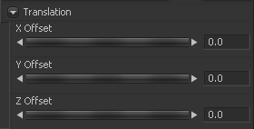
A Thumbwheel control is identical to a slider except that this control does not have a maximum or minimum value. Thumbwheel controls are typically used on angle parameters, although they do have other uses. To use a thumbwheel control, click on the center portion and drag left or right.
Fine tune the parameter by clicking the arrow heads at either end of the control. The artist can also click directly on the control and then use the left and right cursor arrows to adjust the controls values. As with the slider control the CTRL and SHIFT modifiers can be used to increase or decrease the size of the control change.
Values can also be entered directly into the edit box to the controls right.
If the thumbwheel has been altered from its default value, a small indicator will appear above the bar. Clicking on this circle will reset the thumbwheel to its default.
Range Controls
Range Controls are used to specify a low value and a high value. To adjust the values, click and drag the handles on either end of the range bar. To adjust the high and low values of the range simultaneously, click and drag from the center of the range bar.
Expand or contract the range symmetrically by holding down the CTRL key and dragging either end of the range bar.
The Range control is actually two separate controls, a Low Range and a High Range. These can be animated and modified individually.
Checkboxes
Checkboxes are controls that have either an on or off value. Clicking on the checkbox control will toggle the state between selected and not selected. When this control is animated a value of 0 means the control is off while a value of 1.0 or greater will turn it on.
Drop-Down Lists
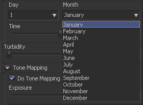
Drop-Down lists are used to select one option from a list of options. Clicking on the control will reveal the full list of available options for selection. One the list is open clicking on any of the entries in the list will cause that entry to be selected.
Only one option can be selected at a time, and the currently selected option will be displayed in the control when the menu is closed.
When a drop down box control is animated the integer value 0 represents the first item in the selection, integer value 1 represents the second entry in the list, and so forth.
Button Arrays
Button Arrays are groups of buttons that allow the artist to select from a range of options. They are almost identical in Function to drop down menu controls, except that in the case of a Button Array it is possible to see all of the available options at a glance.
Color Wheel And Picker
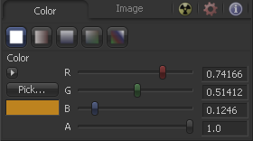
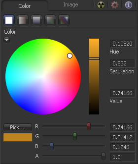
The Color Picker is displayed wherever a tool parameter requires a color as its value. The selected color is shown in the swatch below the pick button. The swatch has two halves; the left half shows the color and the right half shows the color overlaid on a checkerboard to visualize the transparency.
The color picker is extremely flexible and has four different techniques for selecting and displaying colors.
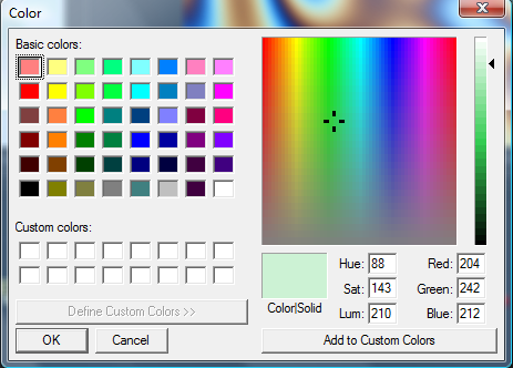
The Windows Color Picker
Clicking on the Pick button will display the operating systems standard Color Selector dialog. This dialog can then be used to select a color, and clicking on OK will apply that color to the control.
As the behaviour of this control may change with the operating system used, please consult your operating systems documentation for additional details on the use of this dialog.
The Color Wheel
Clicking on the small arrow button above the pick button will reveal a Color Wheel with a luminance bar, which can be used to select a color.
Picking Colors From An Image
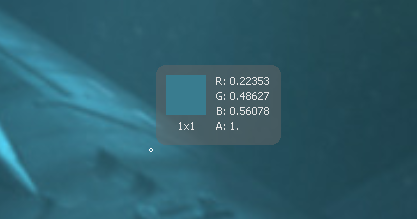
To select a color directly from an image displayed in one of the Fusion display views, click and hold the Pick button. The cursor will change to the eyedropper tool. While still holding down the mouse button, move the eyedropper over the view. A popup swatch will appear above the mouse pointer showing the selected color and its values.
When the color displayed is the one desired, release the mouse button to set that color.
The color picker normally selects from a single pixel in the image. Adjust the size of the selection by holding the Ctrl key and dragging while picking. The size change applies to all color pickers until the size is changed again.
Gradients
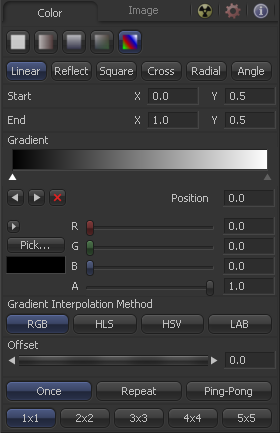
The bar Gradient control is used to create the colors that a gradient follows from start to finish, using keyframe colors set along the length of the bar. The gradient control is actually nine or ten controls in total, which are described below.
Gradients have their own context menu, accessed by right-clicking directly on the gradient bar. This provides options for animating, publishing and connecting one gradient to another. It also reveals one modifier specific to gradients that builds a custom gradient by sampling colors from an image produced by a tool in the flow.
Use this button array to select the method used to draw the gradient. Select from linear, reflect, square, cross, radial and angle gradient types.
The Start and End Position controls are represented by two crosshairs in the display views, as well as a set of X and Y controls. They determine where the gradient physically begins and ends.
This bar type gradient control is used to select the colors through which the gradient will transition when moving from the start position to the end position. Only two color positions are available by default, the start and end colors. To modify one of the colors, select the triangle below the color on the bar. Use the Color Selector controls below to set the color.
New keyframes are added to the gradient control by clicking just beneath the gradient bar. The position of the keyframes can be adjusted by click-dragging on the keyframe. To copy an existing keyframe, hold the Ctrl key down before dragging the keyframe.
To remove a keyframe, click-drag the keyframe straight up past the gradient bar or select the keyframe and click on the red X button.
This button array determines what color space is used to calculate the colors between keyframes.
The Offset control is used to offset the position of the gradient relative to the start and end markers. This control is most useful when used in conjunction with the repeat and ping-pong modes described below.
These three buttons are used to set the behavior of the gradient when the offset control scrolls the gradient past its start and end positions.
These buttons control the amount of sub-pixel precision used when the edges of the gradient become visible in repeat mode, or when the gradient is animated. Higher settings will take significantly longer to render.
| The contents of this page are copyright by eyeon Software. |

