Eyeon:Manual/Tool Reference/Creator/TextPlus
From VFXPedia
|
Creator Tools |
|
Text + |
Text Plus [Txt+] | |
|
Fusion's text tool is an advanced character generator capable of 3D transformations, multiple styles and several layers of shading. Text can be laid out to a user-defined frame, circle or along a path. Any True Type or Postscript 1 font installed on the computer can be used to create text. Support for multibyte and unicode characters allows text generation in any language, including right to left and vertically oriented text. This tool generates a 2D image. To produce extruded 3D text with optional beveling see the Text 3D tool. | |
Contents |
Image Tab
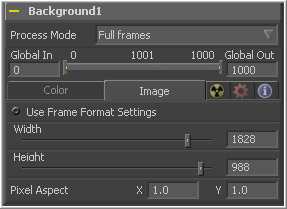
See the Creator Common Controls section at the beginning of this chapter for a description of the controls under this tab.
Text Tab
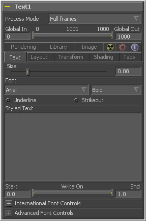
This control is used to increase or decrease the size of the text. This is not like selecting a point size in a word processor. The size is relative to the width of the image.
The Font controls are used to select the font used by Fusion to create the text. Fusion has limited support for third-party font managers. Fonts managed by a third-party font manager may need to move to the fonts in the Windows>Fonts folder.
These checkboxes enable the addition of emphasis styles to the font used.
The edit box in this tab is where the text to be created is entered. Any common character can be typed into this box. The common Windows clipboard shortcuts (Ctrl-C to copy, Ctrl-X to Cut, Ctrl-V to paste) will also work, however right clicking on the edit box displays a custom windows context menu.
The Styled Text context menu has the following options.
- Animate
- Use this command to set to a keyframe on the entered text and Animate the content over time.
- Character Level Styling
- This command enables Character Level Styling, which will place a set of controls in the modifiers tab. Use these controls to affect changes in the font, color, size and transformations applied to individual characters.
- Comp Name
- Comp Name puts the name of the composition in the edit box and is generally used to create slates.
- Follower
- Follower is a text modifier that can be used to ripple animation applied to the text across each character in the text. See Text Modifiers at the end of this section.
- Publish
- Publish the text for connection to other text tools.
- Text Scramble
- A text modifier ID is used to randomize the characters in the text. See Text Modifiers at the end of this section.
- Text Timer
- A text modifier is used to count down from a specified time or to output the current date and time. See Text Modifiers at the end of this section.
- Time Code
- A text modifier is used to output Time Code for the current frame. See Text Modifiers at the end of this section.
- Connect To
- Use this option to connect the text generated by this Text tool to the published output of another tool.
- Write On
- This range control is used to quickly apply simple Write On and Write Off effects to the text. To create a write on effect, animate the End portion of the control from 1 to 0 over the length of time required. To create a write off effect, animate the Start portion of the range control from 0 to 1.
This drop down menu can be used to select a language specific to a subset of a font.
This menu provides options for determining the Direction in which the text is to be written.
These menu options are used to determine the text flow from top-bottom, bottom-top, left-right or right-left.
This slider control can be used to override the kerning (spacing between characters) that is defined in the font. Setting this slider to zero (the default value) will cause Fusion to rely entirely on the kerning defined with each character. A value of one will cause the spacing between characters to be completely even, or Monospaced.
This enables kerning as specified in the true type font and is on by default.
Use Font Defined Glyphs, Reordering And Ligation Leave this checkbox selected unless instructed to do otherwise by support.
Right-clicking on this label will display a context menu that can be used to animate the kerning of the text. See the Toolbar section of this tool's documentation later in this chapter for details on manual kerning.
Layout Tab
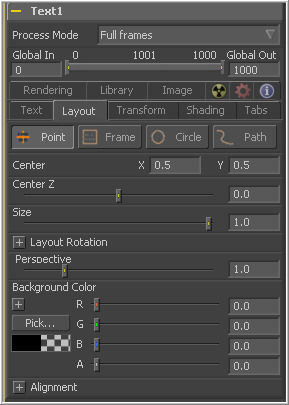
The controls used to position the text are located in the Layout Tab. One of four layout types can be selected using the button array.
- Point
- Point layout is the simplest of the layout modes. Text is arranged according to the around an adjustable center point.
- Frame
- Frame layout allows you to define a rectangular frame used to align the text. The alignment controls are used to justifying the text vertically and horizontally within the boundaries of the frame.
- Circle
- Circle Layout places the text around the curve of a circle or oval. Control is offered over the diameter and width of the circular shape. When the layout is set to this mode, the alignment controls determine whether the text is positioned along the inside or outside of the circle's edge, and how multiple lines of text are justified.
- Path
- Path layout allows you to shape your text along the edges of a path. The path can be used simply to add style to the text, or it can be animated using the Position on Path control that appears when this mode is selected.
These controls are used to position the center of the layout element in space. X and Y are onscreen controls and Center Z is a slider in the tool controls.
This slider is used to control the scale of the layout element.
Select this checkbox and another set of options appears to set the rotation options of the text.
This button array allows you to select the order in which 3D rotations are applied to the text.
These angle controls can be used to adjust the angle of the Layout element along any axis.
The Width control is visible when the layout mode is set to Circle or Frame. The Height control is only visible when the layout mode is set to Frame. They are used to adjust the dimensions and aspect of the Layout element.
This slider control is used to add or remove perspective from the rotations applied by the Angle X, Y and Z controls.
This menu control is only visible when the Layout type is set to Circle. This menu is used to select how the characters are spaced to fit along the circumference.
The Position On Path control is used to control the position of the text along the path. Values less than zero or greater than one will cause the text to move beyond the path in the same direction as the vector of the path between the last two keyframes.
This label only appears when the Layout type is set to Path. It is used to provide access to a context menu that provides options for connecting the path to other paths in the flow, and animating the shape of the path over time.
The text generated by this tool is normally rendered against black. This color picker control can be used to set a new background color.
Consult the Motion Paths chapter of this manual for details.
Two identical sets of controls are used to control Vertical and Horizontal Alignment of the text. Use the first array of buttons to choose the alignment of the text. The slider beneath controls the justification.
Transform Tab
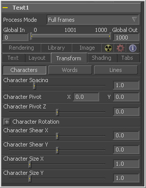
There are three buttons to determine the portion of the text affected by the transformations applied in this tab. Transformations can be applied to line, word and character levels simultaneously. This menu is only used to keep the number of visible controls to a reasonable number.
- Characters
- Each character of text is transformed along its own center axis.
- Words
- Each word is transformed separately on the word's center axis.
- Lines
- Each line of the text is transformed separately on that line's center axis.
The spacing slider is used to adjust the amount of space between each line, word or character. Values less than one will usually cause the characters to begin overlapping.
This provides control over the exact position of the axis. By default, the axis is positioned at the calculated center of the line, word or character. The axis control works as an offset, such that a value of 0.1, 0.1 in this control would cause the axis to be shifted downward and to the right for each of the text elements. Positive values in the Z axis slider will move the axis further along the axis (away from the viewer). Negative values will bring the axis of rotation closer.
These buttons are used to determine the order in which transforms are applied. X, Y and Z would mean that the rotation is applied to X, then Y, and then Z.
These controls can be used to adjust the angle of the text elements in any of the three dimensions.
Adjust these sliders to modify the slanting of the text elements along the X and Y axis.
Adjust these sliders to modify the size of the text elements along the X and Y axis.
Shading Tab
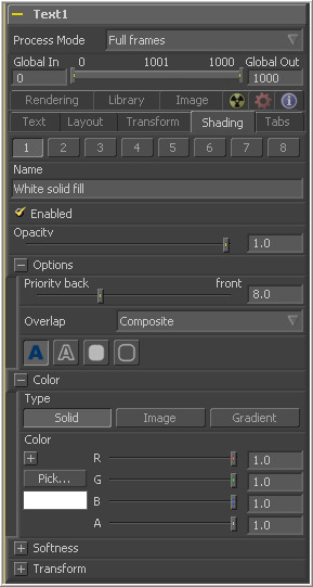
The Shading Tab provides controls to adjust the shading, texture and softness of the text. Transformations can be controlled from this tab as well, applying additional transformations to as many as eight separate text shading elements independently. The number menu is used to select the element affected by adjustments to the controls in this tab.
This text label can be used to assign a more descriptive name to each shading element.
Select this checkbox to enable or disable each layer of shading elements. Element 1 is enabled by default. The controls for a shading element will not be displayed unless this checkbox is selected.
The Opacity slider controls the overall transparency of the shading element. It is usually better to assign opacity to a shading element than to adjust the alpha of the color applied to that element.
This slider determines the layer's order for the shading elements, also known as the Z-order. Slide the control to the right to bring an element closer to the front. Move it to the left to tuck one shading element behind another.
This menu is used to select how the renderer deals with an Overlap between two characters in the text.
- Composite
- This Overlap option will merge the shading over top of itself.
- Solid
- This option sets the pixels in the overlap region to pure opaque.
- Transparent
- This option sets the pixels in the overlap region to pure transparent.
There are four options available from this menu, providing control over how the shading element is applied to the text. Different controls will appear below depending on the element type selected.
- Text Fill
- The shading element is applied to the entire text. This is the default mode.
- Text Outline
- The shading element is drawn as an outline around the edges of the text.
- Border Fill
- The shading element fills a border surrounding the text. Five additional controls are provided with this shading mode.
- Border Outline
- The Border Outline mode draws an outline around the border that surrounds the text. It offers several additional controls.
(All Types) Overlap is used to determine how the shading is handled when portions of the same shading element overlap. Setting this menu to transparent will cause the pixels color and alpha channel to be set to 0 (transparent).
(Outline only) Use this slider control to adjust the thickness of the outline. Higher values equal thicker outlines.
(Outline only) Selecting this checkbox will cause your outline to become thinner where the text is further away from the camera, and thicker where it is closer. This will create a much more realistic outline for text transformed in 3D, but takes significantly longer to render.
(Outline only) Selecting this checkbox will cause the outline to be drawn only on the outside edge of the text. By default the outline is centered on the edge and partially overlaps the text.
(Outline only)This menu provides options for how the corners of the outline are drawn. Options include Sharp, Rounded and Beveled.
(Outline only)This menu offers additional control over the style of the line. In addition to the default solid line, a variety of dash and dot patterns are available.
(Border Fill only) Shape creates a solid rectangular image around the character.
(Border Outline only) Creates a rectangular outline around each character.
(Border Fill only) This is used to control the portion of the text border filled.
- Text
- This draws a border around the entire text.
- Line
- This draws a border around each line of text.
- Word
- This draws a border around each word.
- Character
- This draws a border around each character.
(Border only) Use this slider to change the dimensions of each border.
(Border only) This slider is used to round off the edges of the border.
In addition to solid shading, it is also possible to map an external image onto the text. This menu is used to determine if the color of the shading element is derived from a user-selected color or if it comes from an external image source. Different controls will be displayed below depending on the Color Type selected.
- Solid Mode
- When the type menu is set to Solid mode, color selector controls are provided to select the color of the text.
- Image Mode
- The output of a tool in the flow will be used to texture the Text. The tool used is chosen using the color Image control revealed when this option is selected.
(Image Mode only) This color image text box is used to enter the name of the tool in the flow that will provide the image. You can type the name in with the keyboard, drag the tool from the flow into the text box or right click and select connect to from the context menu to select the image to be used.
(Image Mode only) The image size menu is used to select how the image is mapped to the text.
- Full Image
- This option applies the entire image to the text.
- Text
- This option applies the image to fit the entire set of text.
- Line
- This option applies the image per line of text.
- Word
- This option applies the image per each word of text.
- Character
- This option applies the image per individual character.
These sliders control the softness of the text outline used to create the shading element. Control is provided for the X and Y axis independently.
Selecting this checkbox will cause blur (softness) to be applied to the shading element as well. The effect is best seen when applied to a shading element colored by an external image.
This slider will apply a glow to the softened portion of the shading element.
This slider controls the amount that the result of the softness control is blended back with the original. It can be used to tone down the result of the soften operation.
Selecting the Transform button in the Shading tab will display controls for performing transformations to the shading elements. These controls work in exactly the same way as their equivalents in the Alignment and Layout Tabs, with the addition of a center offset control.
These controls are used to apply offset from the text's global center (as set in the Layout Tab) for the shading elements. A value of X0.0, Y0.1 in the coordinate controls would place the shading element center 10 percent of the image further down the screen along the y-axis. Positive values in the Z-Offset slider control will push the center farther away from the camera, while positive values will bring it closer to the camera.
Tabs Tab
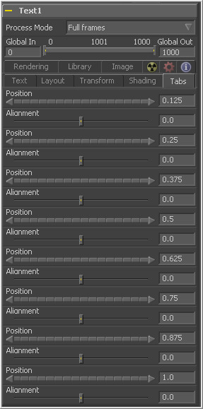
The controls in the Tabs area are used to configure the horizontal screen positions of 8 separate tab stops. Any tab characters in the text will conform to these positions.
Because the tab key is used by Fusion to advance to the next control, it is not possible to enter a tab directly into the Styled Text input. Enter a tab using one of the following methods.
- ASCII Character
- Hold down the Alt key and type 009 on the numeric keypad.
- Copy And Paste
- copy a tab from another document, such as notepad, and paste it into the text box.
This control is used to set the horizontal position of the tab in the frame. The values range from 0.0 to 1.0 where 0 is the far left side and 1 is the far right side of the frame. The position of the tab will be indicated in the display view by a thin vertical white line when the text tool is selected and the tabs tab is open.
Each tab can be set to either left aligned, right aligned or centered. This slider ranges from -1.0 to 1.0, where -1.0 is a left aligned tab, 0.0 is a centered tab and 1.0 is a right aligned tab. Small white boxes at the top of the tab lines indicate that there are tabs present in the flow. Clicking within these boxes will toggle the alignment of the tab between the three states.
Rendering Tab
Use this button array to select the sampling type for shading rendering and transformations. The default of Pixel shading is sufficient for 90% of tasks. To reduce detectable aliasing in the text, set the sampling type to Area. This is slower but may produce better quality results. A setting of None will render faster, but with no additional sampling applied so the quality will be lower.
Use this button array to choose how transformations applied to image shading elements are handled when they wrap off of the text's edges.
This button selection determines the ordering of the shading elements. The default is By Priority, which organizes the shading elements back to front according to the priority back/front slider in each shading elements controls.
Selecting the By Depth (Z-Position) option will re-organize these according to each element's Z position, as set by the element's transformations.
This checkbox determines whether characters that go beyond the plane of the camera will be clipped, or if they will reflect back toward the center of the image. This should normally be enabled for clipping, but some interesting effects can be produced when clipping is disabled.
This slider is used to increase or decrease the amount of anti-aliasing applied to the text. Higher values mean exponentially longer render times, while lower valius reduce render times at the expense of quality.
Click this button to render the output of the text tool to a Macromedia Flash file.
Click this button to render the output of the text tool at the current frame to a dpsReality style DPT file for use with the dpsVelocity editing software.
There are three types of DPT types. Select from Still, Roll and Crawl before clicking on the Render to Reality DPT button above.
This menu selects the resolution of the DPT file output when the Render to DPS/Leitch DPS file button is selected. Select the option that matches the hardware for the DPT, or leave this at auto to have the resolution set by the size of the image created by the text tool.
Library Tab
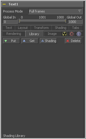
The Shading Library is used to store and retrieve the settings of a text tool for easy re-use. To add a new text element to the library, click on the Put button. All of the current settings for the tool will be saved according to the name assigned.
A thumbnail will appear in the Shading Library showing how that style looks on the letter A.
Click on a shading element in the library, then click on the Get button to apply those settings to the current tool. Get will replace all of the text as well as the style. Clicking on Shading will replace the shading elements only, without affecting the text entered.
Right-click in the shading library window for a list of display options.
Text+ Toolbar
When the Text tool is selected, a toolbar will appear in the display views.
Enable this button to type and edit text directly in the preview window, click on the text to produce a cursor that can be positioned within the text. The cursor can be moved using the arrow keys. Type normally.
This button enables Manual Kerning, which overrides the automatic kerning normally applied to text. A small red dot will appear beneath each character of text in the display view. Click-drag on the dot to reposition a character. Also select multiple characters and move them together. Hold the Alt key down while dragging to constrain motion to a single axis.
Use the arrow keys on the keyboard to make manual adjustments to the position of the selected characters. Hold the Ctrl key down while pressing arrow keys to move the character in smaller increments. Shift will move the characters in larger increments.
To animate the position of each character, right-click on the control label Manual Font Kerning/Placement beneath the Text tab's Advanced Font Controls and select Animate from the context menu. A new key will be set on the animation spline each time a character is moved. All characters are animated with the same spline, as with polyline mask animation.
This button disables the drawing of any outline around the edges of the text. The outline is not a part of the text. It is an onscreen control used to help identify the position of the text.
This button draws an outline around the edges of text which is outside the visible frame. This is useful for locating text which has moved of screen and is no longer rendering a visible result.
This button draws an outline around the edges of text at all time, whether the text is visible within the frame or not.
Tips for TextPlus (edit)
EyeonTips:Manual/Tool Reference/Creator/TextPlus
| The contents of this page are copyright by eyeon Software. |
