User:Gringo/User Controls
From VFXPedia
Contents |
Introduction
User controls are the interface elements like buttons, sliders, image inputs etc. which you can add to particular tools in your composition.
They can be used to create special generalized parameters which control any combination of standard parameters of the tools in the composition for certain purpose.
For instance, you can create a slider called "Lightning from the Left" complemented with a checkbox "Visible Bolt" and then connect various parameters of merges, color correctors, masks and the lightning generator to these two via simple expressions or via connect to. Thus, you create a kind of animation rig and at the time you must change the lightning for 21-st time, you adjust only animation of two parameters instead of reworking the whole setup.
User controls are also useful when you develop your own tools like macros or fuses.
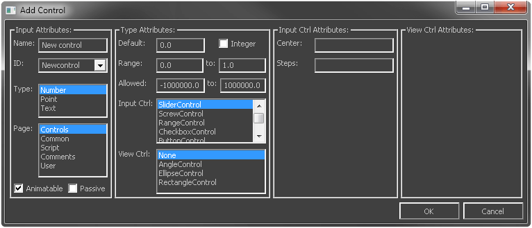
The easiest way to add them is to RMB on a node in the Flow, select Script > UserControls.
The UserControls script also supports editing of existing controls. For this you need to select the ID of a control you want to modify.
If you want to customize the controls further or you are creating multiple controls of the same type, or if you want to create an input which is not supported by the script (Image or 3D Scene), it's better to use a text editor.
Cut the node to Windows Clipboard and paste it to a text editor. After modifications, copy the text and paste it back to Flow.
Here is a reference for user controls' attributes:
Slider
Allows you to change a single float point or integer number value within certain range.
		BeautifulSlider = {				-- the name of the input accessible from scripts and simple expressions
			LINKID_DataType = "Number",
--			INP_Integer = true,			-- makes the slider work only with integer (non-fractional) values
			INPID_InputControl = "SliderControl",
			IC_ControlPage = 0,			-- defines the tab where the control appears in the Control Panel. 0 for the default "Control" tab, 1 and higher to display it in further tabs, -1 to display the control above all the tabs. If the attribute is omitted, the control is displayed in the additional "User" tab
			LINKS_Name = "Beautiful Slider",	-- the name displayed in the Control Panel
 			INP_MinScale = -1,			-- the initial minimum of the slider's range, adjusts automatically as you decrease the value below the range. If the attribute is omitted, the minimum is 0
			INP_MaxScale = 5,			-- the initial maximum of the slider's range, adjusts automatically as you increase the value above the range. If omitted, the maximum is set to 1
			ICD_Center = 1,				-- sets the value at which the slider is centered.. If omitted, the slider is centered in the middle of range or at 0 if the minimum is negative
--			IC_Steps = 21,				-- sets the total number of positions through which the slider moves being selected and adjusted by left-right arrows
			INP_Default = 1,			-- the default value
		},
Mix Slider
Very similar to the simple slider, but istead of one label has two, at the low and high end of the range. Such sliders are more suitable when you mix between two states rather than increase and decrease certain quality. Examples are the Merge tool (Subtractive-Additive) and Dissolve (Background-Foreground).
		BeautifulMixSlider = {				-- the name of the input accessible from scripts and simple expressions
			LINKID_DataType = "Number",
--			INP_Integer = true,			-- makes the slider work only with integer (non-fractional) values
			INPID_InputControl = "SliderControl",
			IC_ControlPage = 0,			-- defines the tab where the control appears in the Control Panel. 0 for the default "Control" tab, 1 and higher to display it in further tabs, -1 to display the control above all the tabs. If the attribute is omitted, the control is displayed in the additional "User" tab
			SLCS_LowName = "Worse",			-- the label displayed at the lower (left) end of the slider. This attribute is used instead of usual LINKS_Name
			SLCS_HighName = "Better",		-- the label displayed at the higher (right) end of the slider. This attribute is used instead of usual LINKS_Name
 			INP_MinScale = -1,			-- the initial minimum of the slider's range, adjusts automatically as you decrease the value below the range. If the attribute is omitted, the minimum is 0
			INP_MaxScale = 5,			-- the initial maximum of the slider's range, adjusts automatically as you increase the value above the range. If omitted, the maximum is set to 1
			ICD_Center = 1,				-- sets the value at which the slider is centered.. If omitted, the slider is centered in the middle of range or at 0 if the minimum is negative
--			IC_Steps = 21,				-- sets the total number of positions through which the slider moves being selected and adjusted by left-right arrows
			INP_Default = 1,			-- the default value
		},
Range
Range control may be used to define well... a linear range within certain limits. It has two number inputs, defined as separate controls and combined into a group.
		RangeMinimum = {
			LINKID_DataType = "Number",
--			INP_Integer = true,			-- makes the minimum input work only with integer (non-fractional) values. You are allowed to use integer for minimum and default float point for maximum for whatever stupid reason
			INPID_InputControl = "RangeControl",
			IC_ControlPage = 0,
			IC_ControlGroup = 1,			-- defines the range control group number. This value has to be the same for the minimum and the maximum of the range and it has to be different from other grouped controls
			IC_ControlID = 0,			-- assigns this input as the minimum of the range
			LINKS_Name = "At Least",		-- the label displayed at the low (left) limit of the range
			RNGCS_MidName = "Between",		-- the label displayed in the middle of the range
			INP_MinScale = -0.5,			-- allows extra space on the range below the default minimum value
			INP_MaxScale = 1.5,			-- adds extra space on the range above the default maximum value
--			RNGCD_LowOuterLength = "0.1",		-- adds a visual shift from the minimum range value
			INP_Default = 0,			-- default minimum value of the range
		},
		RangeMaximum = {
			LINKID_DataType = "Number",
--			INP_Integer = true,			-- makes the maximum input work only with integer (non-fractional) values. You are allowed to use integer for maximum and default float point for minimum for whatever stupid reason
			INPID_InputControl = "RangeControl",
			IC_ControlPage = 0,
			IC_ControlGroup = 1,
			IC_ControlID = 1,			-- assigns this very control as the maximum of the range
			LINKS_Name = "At Most",			-- the label displayed at the high (right) limit of the range
			INP_MinScale = -0.5,
			INP_MaxScale = 1.5,
--			RNGCD_HighOuterLength = "0.1",		-- adds a visual shift from the maximum range value
			INP_Default = 1,			-- default maximum value of the range
		},
Checkbox
Represents a parameter which can take two states. It returns a number: 0 for unchecked and 1 for checked state. You can also use an additional CBC_TriState attribute to let it take a third state which returns a value of -1.
		BeautifulCheckbox = {
			LINKID_DataType = "Number",
			INPID_InputControl = "CheckboxControl",
			IC_ControlPage = 0,
			LINKS_Name = "Beautiful Checkbox",
--			CBC_TriState = true,			-- allows the checkbox to take three states (0, 1, -1) instead of default two.
			INP_Default = 1,
		},
As soon as checkboxes don't really require a lot of space, it's a good idea to group them together in one row, using the ICD_Width attribute. 1 is the full width, so if you want to combine two checkboxes, set it to 0.5, for three checkboxes use 0.333 and 0.25 for four checkboxes.
		Checkbox1 = {
			LINKID_DataType = "Number",
			INPID_InputControl = "CheckboxControl",
			LINKS_Name = "Checkbox 1",
			ICD_Width = 0.333,			-- decreases the horizontal size of the control allowing to combine several checkboxes in one row
		},
		Checkbox2 = {
			LINKID_DataType = "Number",
			INPID_InputControl = "CheckboxControl",
			LINKS_Name = "Checkbox 2",
			ICD_Width = 0.333,
		},
		Checkbox3 = {
			LINKID_DataType = "Number",
			INPID_InputControl = "CheckboxControl",
			LINKS_Name = "Checkbox 3",
			ICD_Width = 0.334,
		},
Multi-Button
This kind of control offers the user a choice of a few options. The functionality is similar to a drop-down list, but all the options are visible at all times which visualizes the choice better and reduces the number of mouse clicks, but limits the number of possible options by the width of the Control Panel.
Multi-Button returns an integer number depending on the choice, starting from 0.
		BeautifulButtons = {				-- the name of the input accessible from scripts and simple expressions
			LINKID_DataType = "Number",
			INPID_InputControl = "MultiButtonControl",
			IC_ControlPage = 0,			-- defines the tab where the control appears in the Control Panel. 0 for the default "Control" tab, 1 and higher to display it in further tabs, -1 to display the control above all the tabs. If the attribute is omitted, the control is displayed in the additional "User" tab
			LINKS_Name = "Beautiful Buttons",	-- the name displayed in the Control Panel
--			MBTNC_ShowName = "false",		-- hides the name of the button set. You can use it if the text on the buttons perfectly explains the meaning of the choice
			{ MBTNC_AddButton = "Zero", },		-- the text on the button 0
			{ MBTNC_AddButton = "One", },		-- the text on the button 1
			{ MBTNC_AddButton = "Two", },		-- the text on the button 2
			{ MBTNC_AddButton = "Tree", },		-- the text on the button 3
			MBTNC_StretchToFit = true,		-- makes the buttons stretch proportionally as you adjust the Control Panel width
			INP_Default = 0,			-- the default choice
		},
If you want to give the buttons different width or if you want to have more than one row of the buttons (for instance, when the text on the buttons is too long for one row of default Control Panel width), you can use a button-specific MBTNCD_ButtonWidth attribute, which sets the button width related to the Control Panel width.
		MoreBeautifulButtons = {
			LINKID_DataType = "Number",
			INPID_InputControl = "MultiButtonControl",
			LINKS_Name = "Beautiful Arranged Buttons",
			{ MBTNC_AddButton = "Zero", MBTNCD_ButtonWidth = 0.5 },	-- sets all the following buttons width as a half of the Control Panel
			{ MBTNC_AddButton = "One", },
			{ MBTNC_AddButton = "Two", MBTNCD_ButtonWidth = 0.25 },	-- sets all the following buttons width as a quarter of the Control Panel
			{ MBTNC_AddButton = "Tree", },
			{ MBTNC_AddButton = "Four", },
			{ MBTNC_AddButton = "Five", },
			{ MBTNC_AddButton = "6", MBTNCD_ButtonWidth = 0.1 },	-- sets all the following buttons width as one tenth of the Control Panel
			{ MBTNC_AddButton = "7", },
			{ MBTNC_AddButton = "8", },
			{ MBTNC_AddButton = "9", },
			{ MBTNC_AddButton = "10", },
			{ MBTNC_AddButton = "11", },
			{ MBTNC_AddButton = "12", },
			{ MBTNC_AddButton = "13", },
			{ MBTNC_AddButton = "14", },
			{ MBTNC_AddButton = "15", },
		},
Color Control
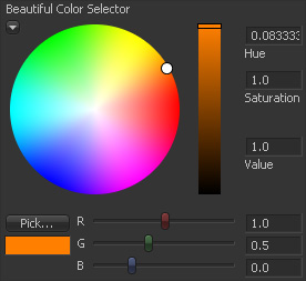
Lets you select a color or, more exactly, a number value corresponding to a channel by using sliders, color wheel or by picking it from an image in a Display View.
The Color control can be created for a single channel or for any combinations of standard Fusion channels. Although, the color wheel is displayed only when you involve all the three basic color channels (RGB).
Every channel's input is defined as a separate control, very similar to the Slider, combined into a group. Each input has to get a unique ID, based on which it's bound to a specific channel (Red = 0, Green = 1, Blue = 2, Alpha = 3, Z Depth = 16 and so on).
With the Color control you can, for instance, pick 3D position, velocity and depth from rendered images.
		RedInput = {					-- the name of the input accessible from scripts and simple expressions. Note, that it doesn't affect the channel assignment. It has no effect on the displayed input name either
			LINKID_DataType = "Number",
			INPID_InputControl = "ColorControl",
			IC_ControlPage = 0,			-- defines the tab where the control appears in the Control Panel. 0 for the default "Control" tab, 1 and higher to display it in further tabs, -1 to display the control above all the tabs. If the attribute is omitted, the control is displayed in the additional "User" tab
			IC_ControlGroup = 2,
			IC_ControlID = 0,
			LINKS_Name = "Beautiful Color Selector", -- the name for the entire Color control group displayed on the Control Panel
			CLRC_ShowWheel = true,			-- makes the color wheel expanded by default. If the attribute is omitted, it's collapsed by default
			INP_MinScale = -1,
			INP_MaxScale = 5,
			ICD_Center = 1,
			INP_Default = 1,
		},
		GreenInput = {
			LINKID_DataType = "Number",
			INPID_InputControl = "ColorControl",
			IC_ControlPage = 0,
			IC_ControlGroup = 2,
			IC_ControlID = 1,
			INP_MinScale = -1,
			INP_MaxScale = 5,
			ICD_Center = 1,
			INP_Default = 1,
		},
		BlueInput = {
			LINKID_DataType = "Number",
			INPID_InputControl = "ColorControl",
			IC_ControlPage = 0,
			IC_ControlGroup = 2,
			IC_ControlID = 2,
			INP_MinScale = -1,
			INP_MaxScale = 5,
			ICD_Center = 1,
			INP_Default = 1,
		},
Color Wheel
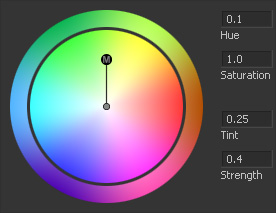
Color Wheel control is designed specifically for color correction purposes to modify existing colors unlike the more general Color control which allows you to define particular channel values.
It consists of four separate inputs: Hue, Saturation, Tint and Strength, defined as separate controls and combined into a group.
A working example of this control is in the ColorCorrector tool.
		HueInput = {					-- the name of the input accessible from scripts and simple expressions. Note, that it doesn't affect assignment of the input as a particular parameter of the Color Wheel. It has no effect on the displayed input name either
			LINKID_DataType = "Number",
			INPID_InputControl = "ColorWheelControl",
			IC_ControlPage = 0,			-- defines the tab where the control appears in the Control Panel. 0 for the default "Control" tab, 1 and higher to display it in further tabs, -1 to display the control above all the tabs. If the attribute is omitted, the control is displayed in the additional "User" tab
			IC_ControlGroup = 3,			-- defines the color wheel group number. This value has to be the same for all the controls of this group and it has to be different from other grouped controls
			IC_ControlID = 0,			-- assigns this input as the Hue of the Color Wheel
		},
		SaturationInput = {				-- the name of the input accessible from scripts and simple expressions. Note, that it doesn't affect assignment of the input as a particular parameter of the Color Wheel. It has no effect on the displayed input name either
			LINKID_DataType = "Number",
			INPID_InputControl = "ColorWheelControl",
			IC_ControlPage = 0,
			IC_ControlGroup = 3,
			IC_ControlID = 1,			-- assigns this input as the Saturation of the Color Wheel
			INP_Default = 1,			-- should be added particularly for Saturation because while for the other controls of the Color Wheel group 0 value means no effect, here 0 means complete desaturation of the source
		},
		TintInput = {					-- the name of the input accessible from scripts and simple expressions. Note, that it doesn't affect assignment of the input as a particular parameter of the Color Wheel. It has no effect on the displayed input name either
			LINKID_DataType = "Number",
			IC_ControlPage = 0,
			INPID_InputControl = "ColorWheelControl",
			IC_ControlGroup = 3,
			IC_ControlID = 2,			-- assigns this input as the Tint of the Color Wheel
		},
		StrengthInput = {				-- the name of the input accessible from scripts and simple expressions. Note, that it doesn't affect assignment of the input as a particular parameter of the Color Wheel. It has no effect on the displayed input name either
			LINKID_DataType = "Number",
			INPID_InputControl = "ColorWheelControl",
			IC_ControlPage = 0,
			IC_ControlGroup = 3,
			IC_ControlID = 3,			-- assigns this input as the Strength of the Color Wheel
		},
Text
Lets you input or output text on the Control Panel
		CleverText = {
			LINKID_DataType = "Text",		-- the name of the input accessible from scripts and simple expressions
			INPID_InputControl = "TextEditControl",
			IC_ControlPage = 0,			-- defines the tab where the control appears in the Control Panel. 0 for the default "Control" tab, 1 and higher to display it in further tabs, -1 to display the control above all the tabs. If the attribute is omitted, the control is displayed in the additional "User" tab
			LINKS_Name = "Clever Text",		-- the name of the field displayed in the Control Panel
--			TEC_ReadOnly = true,			-- forbids the direct editing in the text field, but you still can connect it with simple expressions and apply text modifiers to it
			TEC_Lines = 2,				-- defines the height of the field in text lines
			INPS_DefaultText = "A fragment of a very clever text".."\n".."extending to two lines",
		},
Image Input
The input type which lets you feed an image to your tool
		BeautifulImage = {				-- the name of the input accessible from scripts and simple expressions
			LINKID_DataType = "Image",
			LINK_Main = 1,				-- adds a node input. 1 for gold, 2 for green, 3 for pink, 4 for violet, 5 and higher for white node input. The number also defines the connection priority for the input when you drag a pipe over the node
			INPID_InputControl = "ImageControl", 	-- adds a drag 'n' drop input to the Control Panel of the tool
			IC_ControlPage = 0,			-- defines the tab where the control appears in the Control Panel. 0 for the default "Control" tab, 1 and higher to display it in further tabs, -1 to display the control above all the tabs. If the attribute is omitted, the control is displayed in the additional "User" tab
			LINKS_Name = "Beautiful Image",		-- the name displayed in the Control Panel and in the tool tip when you hover the mouse over the node input
		},
EffectMask Input
A specially reserved name of the Image type input which is displayed as the lavender node input
		EffectMask = {
			LINKID_DataType = "Image",
			LINK_Main = 1,				-- adds the node input. Whatever value >=1 is set, the color will remain lavender
			INPID_InputControl = "ImageControl", 	-- adds a drag 'n' drop input to the Control Panel of the tool
			IC_ControlPage = 0,			-- defines the tab where the control appears in the Control Panel. 0 for the default "Control" tab, 1 and higher to display it in further tabs, -1 to display the control above all the tabs. If the attribute is omitted, the control is displayed in the additional "User" tab
			LINKS_Name = "Effect Mask",		-- the name displayed in the Control Panel and in the tool tip when you hover the mouse over the node input
		},
3D Scene Input
The input type which lets you feed a 3D scene to your tool. Very similar to the Image Input, but expects a different data type.
		SceneInput = {				-- the name of the input accessible from scripts and simple expressions
			LINKID_DataType = "DataType3D",
			LINK_Main = 1,				-- adds a node input. 1 for gold, 2 for green, 3 for pink, 4 for violet, 5 and higher for white node input. The number also defines the connection priority for the input when you drag a pipe over the node
			INPID_InputControl = "ImageControl", 	-- adds a drag 'n' drop input to the Control Panel of the tool
			IC_ControlPage = 0,			-- defines the tab where the control appears in the Control Panel. 0 for the default "Control" tab, 1 and higher to display it in further tabs, -1 to display the control above all the tabs. If the attribute is omitted, the control is displayed in the additional "User" tab
			LINKS_Name = "3D Scene",		-- the name displayed in the Control Panel and in the tool tip when you hover the mouse over the node input
		},
Label
Basically, a single-line text displayed on the Control Panel between other controls for categorization or for information
		IndependentLabel = {
			INPID_InputControl = "LabelControl",
			IC_ControlPage = 0,
			LINKS_Name = "Independent Label",	-- the text of the label
		},
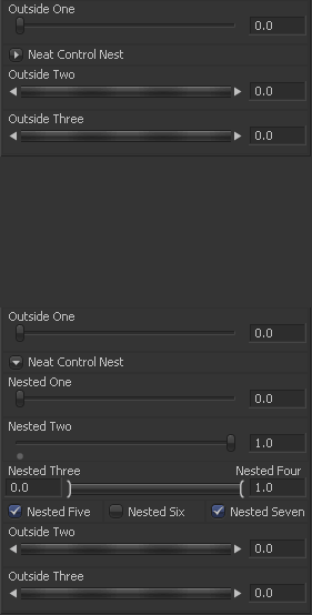
You can also create control nests by means of the Label control to organize interface of multiple-control tools better. The advantage of the nests over tabs is that you have an option to display any combination of the control groups on one page for easier simultaneous adjustment and overview.
		NeatControlNest = {
			INPID_InputControl = "LabelControl",
			IC_ControlPage = 0,
			LINKS_Name = "Neat Control Nest",	-- the text against the nest control
			LBLC_DropDownButton = true,		-- turns the Label control into a nest
			LBLC_NumInputs = 7,			-- defines how many following controls will be included into the nest. Note, that if at least one control of a group (like Range or Color Wheel) gets into this number, the whole group is included to the nest
			INP_Default = 1,			-- makes the nest unfolded by default. If the attribute set to 0 or omitted, the nest is collapsed
		},
In this example you can see, that the LBLC_NumInputs attribute value considers every input separately and has nothing to do with the rows of the interface.
User Controls Tips
Controls Width
You can arrange the controls nicer by putting them next to each other in one line. For this you can re-define the controls' width with the ICD_Width attribute.
Although, it makes sense mostly for checkboxes, text fields, drop-down lists and multi-buttons, you can do this to any type of controls.
                HalfSlider = {
                    LINKID_DataType = "Number",
                    INPID_InputControl = "SliderControl",
                    LINKS_Name = "Half-Slider",
                    ICD_Width = 0.5,
                },
                Option1 = {
                    LINKID_DataType = "Number",
                    INPID_InputControl = "CheckboxControl",
                    LINKS_Name = "Option 1",
                    ICD_Width = 0.25,
                },
                Option2 = {
                    LINKID_DataType = "Number",
                    INPID_InputControl = "CheckboxControl",
                    LINKS_Name = "Option 2",
                    ICD_Width = 0.25,
                },
                ButtonsSet1 = {
                    LINKID_DataType = "Number",
                    INPID_InputControl = "MultiButtonControl",
                    LINKS_Name = "This Is the Question",
                    ICD_Width = 0.5,
                    { MBTNC_AddButton = "To Be", },
                    { MBTNC_AddButton = "Not to Be", },
                    MBTNC_StretchToFit = true,
                },
                ButtonsSet2 = {
                    LINKID_DataType = "Number",
                    INPID_InputControl = "MultiButtonControl",
                    LINKS_Name = "Sea of Troubles Treatment",
                    ICD_Width = 0.5,
                    { MBTNC_AddButton = "Suffer", },
                    { MBTNC_AddButton = "Take Arms", },
                    MBTNC_StretchToFit = true,
                },
Links
Script/Reference/Applications/Fusion/Classes/Input/Attributes
Script/Reference/Applications/Fuse/Classes/ScriptOperator/AddInput


