Eyeon:Manual/Tool Controls/Control Types
From VFXPedia
Contents |
Types Of Controls
Although a few tools use highly-customized interface elements, the vast majority of controls are modified using a mix of sliders, angle wheels, checkboxes and so on. The following is a description of the most common control types found in Fusion.
Slider Controls
Slider Controls are used to select a single value from a range of values. Slider controls are often set to a default value but it is usually possible to manually add values outside of that default range.
Drag the slider left to decrease the value and to the right to increase the value. Place the pointer over the slider bar, press the left mouse button and use the cursor arrow keys to change the values in small increments. Click on the slider's gutter to make large adjustments. Additionally, type a value directly into the edit box to the right.
Thumbwheel
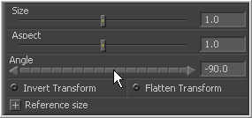
A Thumbwheel control is basically a slider that does not have a maximum or minimum value. Thumbwheel controls are typically used on angle parameters, although they do have other uses. To use a thumbwheel control, click on the center portion and drag left or right.
Fine tune the parameter by clicking the arrow heads at either end of the control. As with all Fusion controls, values can be typed directly in the text box.
Range Controls
Range Controls are used to define a range of values. To adjust the end values, drag the handles on either end. To move the entire range, drag the center of the range (colored bar). Expand or contract the range symmetrically by holding down the Ctrl key and dragging either end of the range bar.
Checkboxes
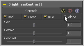
Checkboxes are controls that have either an on or off value. As with most of the controls in Fusion, they can be animated. The spline that controls an animated control steps in and out when viewed in the spline editor.
Drop-Down Lists
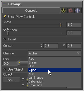
Drop-Down Lists are used to select one option in a list of options. They function in much the same way as checkboxes. They are either at one specific value or another. When animated, the transition between options is a step in/out.
Color Wheel And Picker
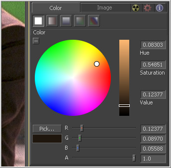
The Color Picker is displayed wherever a tool parameter requires a color as its value. The selected color is shown in the swatch below the pick button. The swatch has two halves; the left half shows the color and the right half shows the color overlaid on a checkerboard to visualize the transparency.
The color picker is extremely flexible and has four different techniques for selecting and displaying colors.
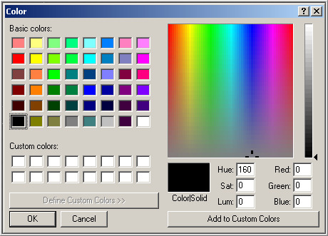
The Windows Color Picker Click on the Pick button to display the standard Windows Color Picker. Select one of the pre-saved colors or create custom ones by either using the sliders or entering values in the text boxes.
The Color Wheel
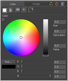
Clicking on the small arrow button above the pick button will reveal a Color Wheel with a luminance bar, which can be used to select a color.
Picking Colors From An Image
To use the picker, click and hold the Pick button. The cursor will change to the eyedropper tool. While still holding down the mouse button, move the eyedropper over the view. The swatch will interactively display color values, and the selected color will fill the background of the color button. When the color displayed is the one desired, release the mouse button to set that color. The color picker normally selects from a single pixel in the image. Adjust the size of the selection by holding the Ctrl key and dragging while picking. The size change applies to all color pickers until the size is changed again.
Gradients
The bar Gradient control is used to create the colors that a gradient follows from start to finish, using keyframe colors set along the length of the bar. The gradient control is actually nine or ten controls in total, which are described below.
Gradients have their own context menu, accessed by right-clicking directly on the gradient bar. This provides options for animating, publishing and connecting one gradient to another. It also reveals one modifier specific to gradients that builds a custom gradient by sampling colors from an image produced by a tool in the flow.
Use this button array to select the method used to draw the gradient. Select from linear, reflect, square, cross, radial and angle gradient types.
The Start and End Position controls are represented by two crosshairs in the display views, as well as a set of X and Y controls. They determine where the gradient physically begins and ends.
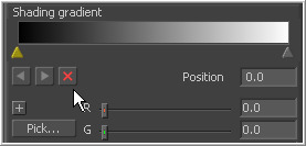
This bar type gradient control is used to select the colors through which the gradient will transition when moving from the start position to the end position. Only two color positions are available by default, the start and end colors. To modify one of the colors, select the triangle below the color on the bar. Use the Color Selector controls below to set the color.
New keyframes are added to the gradient control by clicking just beneath the gradient bar. The position of the keyframes can be adjusted by click-dragging on the keyframe. To copy an existing keyframe, hold the Ctrl key down before dragging the keyframe.
To remove a keyframe, click-drag the keyframe straight up past the gradient bar or select the keyframe and click on the red X button.
This button array determines what color space is used to calculate the colors between keyframes.
The Offset control is used to offset the position of the gradient relative to the start and end markers. This control is most useful when used in conjunction with the repeat and ping-pong modes described below.
These three buttons are used to set the behavior of the gradient when the offset control scrolls the gradient past its start and end positions.
These buttons control the amount of sub-pixel precision used when the edges of the gradient become visible in repeat mode, or when the gradient is animated. Higher settings will take significantly longer to render.

