< Previous | Contents | Next >
Color Controls
The color Controls can be set up in a number of different ways.

-- Color Control/Picker RGB sliders withe the Color Wheel/Swatch is hidden
InRed = self:AddInput("Red", "Red", { -- UI Label, Internal Ref
ICS_Name LINKID_DataType INPID_InputControl
INP_Default INP_MaxScale CLRC_ShowWheel
IC_ControlGroup number it 2
IC_ControlID
})
= "Color",
= "Number",
= "ColorControl", -- Type of Control
= 1.0,
= 1.0,
= false,
= 2, -- Groups Controls together. Make Group
= 0,
InGreen = self:AddInput("Green", "Green", { -- UI Label, Internal Ref LINKID_DataType = "Number",
INPID_InputControl = "ColorControl", -- Type of Control INP_Default = 0.9,
IC_ControlGroup = 2, -- Put this into a Group and number it 2 IC_ControlID = 1,
})
InBlue = self:AddInput("Blue", "Blue", {--UI Label, Internal Ref LINKID_DataType = "Number",
INPID_InputControl = "ColorControl", -- Type of Control INP_Default = 0.6,
IC_ControlGroup = 2, -- Put this into a Group and number it 2 IC_ControlID = 2,
})
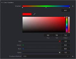
Color control can show or hide the Color Wheel, and also set default color. Color picker is built into the color controls and these can pick RGBA or any auxiliary channel present.