< Previous | Contents | Next >
On Screen
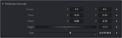
These Point controls have 2 values for X and Y. On screen crosshairs, points and crosses can be defined, along with default position.
-- Point controls are 2D used for on screen manipulation returning
2 values X and Y
InCenter = self:AddInput("Center", "Center", { --UI Label, Internal Ref LINKID_DataType = "Point", -- Retrurns 2 values X and Y INPID_InputControl = "OffsetControl", -- Type of Control INPID_PreviewControl = "CrosshairControl", -- Display Control
INP_DefaultX = 0.5,
INP_DefaultY = 0.5,
})
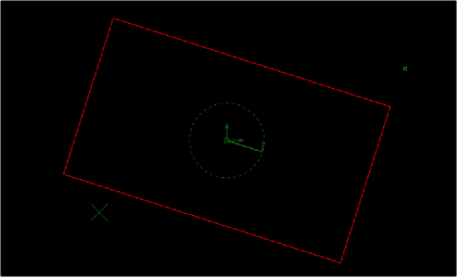
Rectangle and Angle controls can be linked to Sliders and Thumbwheel Screw controls.
-- The size Control is a slider with a connected onscreen Rectangle control
InSize = self:AddInput("Size", "Size", { LINKID_DataType = "Number", INPID_InputControl = "SliderControl",
INP_Default = 1.0,
})
--Using Set Attributes, add OnScreen Rectangle connected to Center, Size & Angle
InSize:SetAttrs({
INPID_PreviewControl = "RectangleControl", -- Display Control Type RCP_Center = InCenter, -- Link to InCenter control above for location RCP_Angle = InAngle, -- Link Rotation to InAngle above RCD_LockAspect = 1.0,
})
The onscreen widgets can be linked together, to have angle and rectangle controls associated with a Point Control. Selection priority can be set to make it easy to select overlapping controls.