< Previous | Contents | Next >
The parameters of text generators are divided into two panels in the Video Inspector: the Title panel and the Settings panel.
— The Title panel contains all of the text editing, styling, and sizing controls used to edit the contents and look of a title in your project, including the Rich Text, Drop Shadow, Stroke, and Background parameters.
— The Settings panel contains the same Composite, Transform, and Cropping parameters that all other clips in DaVinci Resolve have. These parameters are intended for compositing and animating a title.
Shared Title Generator Parameters
With the exception of the Text+ generator, all other title generators in DaVinci Resolve are capable of rich text styling. This means you can select any portion of a generator’s text and style it differently. For example, you could have three lines of text within a single generator and style each line individually to create a particular design.
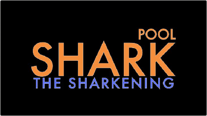
A single generator with three lines of differently styled text
Each title generator shares the same parameters in the Video Title panel of the Inspector for editing and styling text:
— Rich Text: A control group consisting of a text entry field and parameters that can be used to style different parts of the text independently.
— Text: A text entry field for editing the title being generated. If no characters are selected, the styling controls affect the entire block of text. If you select a specific set of characters, the styling controls only affect the selection. Text in this field can also be edited directly in the Timeline Viewer.
— Font family: A pop-up for choosing one of the font families installed on your workstation.
— Font face: A pop-up for choosing which face of the font family currently selected to use.
— Color: Opens the standard color picker for choosing a font color.
— Size: Slider for choosing the text size.
— Tracking: Slider that sets the spacing between characters.
— Line spacing: Slider for setting the spacing between the selected line of text and the next one below.
— Font style: Buttons to apply underline, overhead line, strikethrough, superscript, and subscript styling.
— Font case: A pop-up for forcing the text selection to be Mixed Case (the default), All Caps, All Lowercase, Small Caps, or Title Caps.
— Alignment: Buttons to select the method of alignment: left, centered, right, or justified.
— Anchor: Buttons for selecting how text is anchored to the current position, both horizontally (top, centered, bottom) and vertically (right, centered, left).
— Position: X and Y parameters determining the bottom left-hand corner (the default Anchor settings) of the rich text block being generated. Corresponds to the act of dragging a selected text box in the Timeline Viewer.
— Zoom: X and Y parameters determining the scale of the text. A link button lets you keep the X and Y parameters locked together. Corresponds to the act of resizing a selected text box in
the Timeline Viewer from either the corners (to resize proportionally), or the top/bottom/sides (to stretch or squeeze the text).
— Rotation Angle: A slider for rotating the orientation of the text. Corresponds to the act of rotating a selected text box in the Timeline Viewer using the rotation handle.
— Drop Shadow: A group of controls that lets you apply a customizable drop shadow to every character of text being generated.
— Color: Opens the standard color picker for choosing a drop shadow color.
— Offset: X and Y parameters determining how offset the drop shadow is from the original text.
— Blur: A slider for blurring the drop shadow.
— Opacity: A slider determining how transparent the drop shadow is.
— Stroke: Lets you add an outline to every character of text being generated.
— Color: Opens the standard color picker for choosing the stroke color.
— Size: A slider lets you choose the thickness of the stroke, in pixels.
— Background: This group of controls provides an extremely flexible rectangle or rounded rectangle shape that you can use to add a background, bar, outline, or other intersecting shape to use when designing a title.
— Color: Opens the standard color picker for choosing the interior color of the background shape.
— Outline color: Opens the standard color picker for choosing outline color of the background shape.
— Outline width: A slider lets you choose the thickness of the background shape outline, in pixels.
— Width: A slider lets you choose how wide to make the background shape.
— Height: A slider lets you choose how tall to make the background shape.
— Corner radius: A slider lets you choose the roundness of the rectangle edges.
— Center: X and Y parameters you can use to offset the background shape from the text being generated.
— Opacity: A slider lets you set the transparency of the background shape.