< Previous | Contents | Next >
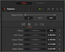
The Color tab allows you to adjust the colors and location within the pattern of the colors for the generated plasma.
Plasma node Color tab
Phase changes the color phase of the entire image. When animated, this creates psychedelic color cycles.
Changes the phase of the individual color channels and the Alpha. When animated, this creates color cycling effects.
Common Controls
The Image and Settings tabs in the Inspector are duplicated in many Generator nodes. These common controls are described in detail at the end of this chapter in “The Common Controls” section.
Text+ [Txt+]
The Text+ node
Text+ Node Introduction
Fusion’s Text+ node is an advanced character generator capable of multiple styles, 3D transformations, and several layers of shading. Text can be laid out to a user-defined frame, circle, or along a path.
Any TrueType, OpenType, or PostScript 1 font installed on the computer can be used to create text. Support for multibyte and Unicode characters allows text generation in any language, including right to left and vertically oriented text.
This node generates a 2D image. To produce extruded 3D text with optional beveling, see the Text 3D node.
Inputs
The one input on the Text+ node is for an effect mask to crop the text.
— Effect Mask: The optional blue effect mask input accepts a mask shape created by polylines, basic primitive shapes, paint strokes, or bitmaps from other tools. Connecting a mask to this input limits the text to only those pixels within the mask.
Basic Node Setup
The Text+ node can be combined with many other nodes to create motion graphics. Below it is connected as the foreground of a Merge node.
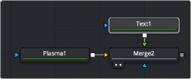
Text+ node connected as the foreground to a Merge node
Inspector
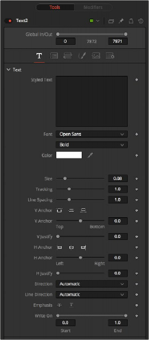
Text+ Text tab controls
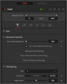
Text Tab
The Text tab in the Inspector is divided into three sections: Text, Advanced Controls, and Tab Spacing. The Text section includes parameters that will be familiar to anyone who has used a word processor. It includes commonly used text formatting options. The Advanced controls are used for kerning options, and the Tab Spacing is used to define the location and alignment of tabs in the layout.
The edit box in this tab is where the text to be created is entered. Any common character can be typed into this box. The common OS clipboard shortcuts (Command-C or Ctrl-C to copy, Command-X or Ctrl-X to cut, Command-V or Ctrl-V to paste) will also work; however, right-clicking in the edit box displays a custom contextual menu. More information on these modifiers can be found at the end of this section.
The Styled Text contextual menu includes the following options:
— Animate: Used to animate the text over time.
— Character Level Styling: Used to change the font, color, size and transformations of individual characters or words through the Modifiers tab.
— Comp Name: Places the name of the composition in the Styled text box for creating slates.
— Follower: A text modifier used to ripple animation across each character of the text.
— Publish: Publishes the text for connection to other text nodes.
— Text Scramble: A text modifier used to randomize the characters in the text.
— Text Timer: A text modifier used to display a countdown or the current date and time.
— Time Code: A text modifier used to display Time Code for the current frame.
— Connect To: Used to connect the text to the published output of another node.
Two Font menus are used to select the font family and typeface, such as Regular, Bold, and Italic.
Sets the basic fill color of the text. This is the same control displayed in the Shading tab color swatch.
This control is used to increase or decrease the size of the text. This is not like selecting a point size in a word processor. The size is relative to the width of the image.
The Tracking parameter adjusts the uniform spacing between each character of text.
Line Spacing adjusts the distance between each line of text. This is sometimes called leading in word- processing applications.
The vertical anchor controls consist of three buttons and a slider. The three buttons are used to align the text vertically to the top of the text, middle of the text, or bottom baseline. The slider can be used to customize the alignment. Setting the vertical anchor will affect how the text is rotated as well as the location for line spacing adjustments. This control is most often used when the Layout type is set to Frame in the Layout tab.
The vertical justify slider allows you to customize the vertical alignment of the text from the V Anchor setting to full justification so it is aligned evenly along the top and bottom edges. This control is most often used when the Layout type is set to Frame in the Layout tab.
The horizontal anchor controls consist of three buttons and a slider. The three buttons justify the text alignment to the left edge, middle, or right edge of the text. The slider can be used to customize the justification. Setting the horizontal anchor will affect how the text is rotated as well as the location for tracking (leading) spacing adjustments. This control is most often used when the Layout type is set to Frame in the Layout tab.
The horizontal justify slider allows you to customize the justification of the text from the H Anchor setting to full justification so it is aligned evenly along the left and right edges. This control is most often used when the Layout type is set to Frame in the Layout tab.
This menu provides options for determining the Direction in which the text is to be written, either horizontally or vertically in either direction. This allows certain Asian languages to flow properly during animation.
These menu options are used to determine the text flow from top to bottom, bottom to top, left to right, or right to left.
These buttons apply the addition of emphasis styles to the text.
This range control is used to quickly apply simple Write On and Write Off effects to the text. To create a Write On effect, animate the End portion of the control from 1 to 0 over the length of time required. To create a Write Off effect, animate the Start portion of the range control from 0 to 1.
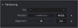
Tab Spacing
The controls in the Tabs section are used to configure the horizontal screen positions of eight separate tab stops. Any tab characters in the text will conform to these positions.
You can add tabs directly in the Styled Text input as you type. You can also add tabs by copying from another document, such as Text on macOS or Notepad on Windows, and paste it into the text box.
This control is used to set the horizontal position of the tab in the frame. The values range from
-0.5 to 0.5, where 0 is the center. The position of the tab will be indicated in the viewer by a thin vertical white line when the Text node is selected. At the top of each tab line in the viewer is a handle. The handle can be used to position the tab manually.
Each tab can be set either left aligned, right aligned, or centered. This slider ranges from -1.0 to 1.0, where -1.0 is a left-aligned tab, 0.0 is a centered tab and 1.0 is a right-aligned tab. Clicking the tab handles in the viewer will toggle the alignment of the tab among the three states.
Advanced font controls
These options allow you to set the reading direction of the text, either automatically or manually. You can specify Left to Right languages like English, German, etc. or Right to Left languages like Arabic and Hebrew.
This slider control can be used to override the kerning (spacing between characters) defined in the font. Setting this slider to zero (the default value) will cause Fusion to rely entirely on the kerning defined with each character. A value of one will cause the spacing between characters to be completely even, or monospaced.
This enables kerning as specified in the TrueType font and is on by default.
If your font supports ligatures, you can activate them here by choosing All Scripts. Ligatures combine individual letters into single glyphs, like ff and fl. If you’re animating individual text letters, often you want the ligature letters separated individually rather than as a single glyph, so None is the default for Latin characters. Ligatures are required to render some languages like Arabic correctly, and use the Non-Latin setting.
Check this box If your font supports the option to split ligatures.
If your font includes stylistic sets, you can select them in the drop-down menu.
This allows you to set OpenType 4 letter tags to activate certain font features. For example, "smcp" will show small capitals, and "frac" will display fractions as ½ instead of 1/2. Not all features are supported by a particular font. A full list of OpenType feature codes can be found here: https://docs. microsoft.com/en-us/typography/opentype/spec/featurelist
Right-clicking on this label will display a contextual menu that can be used to animate the kerning of the text. See the “Toolbar” section of this node later in this chapter for details on manual kerning.
Layout Tab
The controls used to position the text are located in the Layout tab. One of four layout types can be selected using the Type drop-down menu.
— Point: Point layout is the simplest of the layout modes. Text is arranged around an adjustable center point.
— Frame: Frame layout allows you to define a rectangular frame used to align the text. The alignment controls are used for justifying the text vertically and horizontally within the boundaries of the frame.
— Circle: Circle layout places the text around the curve of a circle or oval. Control is offered over the diameter and width of the circular shape. When the layout is set to this mode, the Alignment controls determine whether the text is positioned along the inside or outside of the circle’s edge, and how multiple lines of text are justified.
— Path: Path layout allows you to shape your text along the edges of a path. The path can be used simply to add style to the text, or it can be animated using the Position on Path control that appears when this mode is selected.
These controls are used to position the center of the layout element in space. X and Y are onscreen controls, and Center Z is a slider in the node controls.
This slider is used to control the scale of the layout element.
This slider control is used to add or remove perspective from the rotations applied by the Angle X, Y, and Z controls.
Rotation consists of a series of buttons allowing you to select the order in which 3D rotations are applied to the text. Angle dials can be used to adjust the angle of the Layout element along any axis.
The Width control is visible when the Layout mode is set to Circle or Frame. The Height control is visible only when the Layout mode is set to Frame. Width and Height controls are used to adjust the dimensions and aspect of the Layout element.
This menu control is visible only when the Layout type is set to Circle. This menu is used to select how the characters are spaced to fit along the circumference.
The Position on Path control is used to control the position of the text along the path. Values less than 0 or greater than 1 will cause the text to move beyond the path in the same direction as the vector of the path between the last two keyframes.
The text generated by this node is normally rendered with a transparent background. This Color Picker control can be used to set a background color.
This label appears only when the Layout type is set to Path. It is used to provide access to a contextual menu that provides options for connecting the path to other paths in the node tree, and animating the shape of the path over time.
For more information, see Chapter 73, “Animating with Motion Paths,” in the DaVinci Resolve Reference Manual, or Chapter 11 in the Fusion Reference Manual.
Text+ Transform tab controls
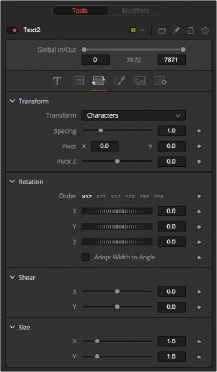
Transform Tab
The Transform tab is used to move, rotate, shear and scale text based on a character, word, or line.
The Transform menu is used to determine the portion of the text affected by the transformations applied in this tab. Transformations can be applied to line, word, and character levels simultaneously. This menu is only used to keep the visible controls to a reasonable number.
— Characters: Each character of text is transformed along its own center axis.
— Words: Each word is transformed separately on the word’s center axis.
— Lines: Each line of the text is transformed separately on that line’s center axis.
The Spacing slider is used to adjust the space between each line, word, or character. Values less than 1 will usually cause the characters to begin overlapping.
This provides control over the exact position of the axis. By default, the axis is positioned at the calculated center of the line, word, or character. The Axis control works as an offset, such that a value of 0.1, 0.1 in this control would cause the axis to be shifted downward and to the right for each of the text elements. Positive values in the Z-axis slider will move the axis of rotation further along the axis (away from the viewer). Negative values will bring the axis of rotation closer.
These buttons are used to determine the order in which transforms are applied. X, Y, and Z would mean that the rotation is applied to X, then Y, and then Z.
These controls can be used to adjust the angle of the text elements in any of the three dimensions.
Adjust these sliders to modify the slanting of the text elements along the X- and Y-axis.
Adjust these sliders to modify the size of the text elements along the X- and Y-axis.
Text+ Shading tab controls
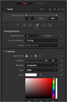
Shading Tab
The Shading tab provides controls to adjust the shading, texture, and softness of the text. Transformations can be controlled from this tab as well, applying additional transformations to as many as eight separate text shading elements independently.
The eight number values in the menu are used to select the element affected by adjustments in this tab.
Select this checkbox to enable or disable each layer of shading elements. Element 1, which is the fill color, is enabled by default. The controls for a shading element will not be displayed unless this checkbox is selected.
This menu allows you to sort the shading elements by number priority, with 1 being the topmost element and 8 being the bottommost element, or Z depth, based on the Z Position parameter.
This text label can be used to assign a more descriptive name to each shading element you create.
The four Appearance buttons determine how the shading element is applied to the text. Different controls will appear below depending on the appearance type selected.
— Text Fill: The shading element is applied to the entire text. This is the default mode.
— Text Outline: The shading element is drawn as an outline around the edges of the text.
— Border Fill: The shading element fills a border surrounding the text. Five additional controls are provided with this shading mode.
— Border Outline: The Border Outline mode draws an outline around the border that surrounds the text. It offers several additional controls.
The Opacity slider controls the overall transparency of the shading element. It is usually better to assign opacity to a shading element than to adjust the Alpha of the color applied to that element.
This menu is used to select how the renderer deals with an overlap between two characters in the text.
— Composite: Merges the shading over the top of itself.
— Solid: Sets the pixels in the overlap region to opaque.
— Transparent: Sets the pixels in the overlap region to transparent.
(Outline only) Thickness adjusts the thickness of the outline. Higher values equal thicker outlines.
(Outline only) Selecting this checkbox will cause your outline to become thinner where the text is farther away from the camera, and thicker where it is closer. This will create a more realistic outline for text transformed in 3D but takes significantly longer to render.
(Outline only) Selecting this checkbox will cause the outline to be drawn only on the outside edge of the text. By default, the outline is centered on the edge and partially overlaps the text.
(Outline only) These buttons provide options for how the corners of the outline are drawn. Options include Sharp, Rounded, and Beveled.
(Outline only) This menu offers additional options for the style of the line. Besides the default solid line, a variety of dash and dot patterns are available.
(Border Fill only) This is used to control the portion of the text border filled.
— Text: This draws a border around the entire text.
— Line: This draws a border around each line of text.
— Word: This draws a border around each word.
— Character: This draws a border around each character.
(Border only) Use this slider to change the dimensions of each border.
(Border Fill and Border Outline only) This slider is used to round off the edges of the border.
Besides solid shading, it is also possible to use a gradient fill or map an external image onto the text. This menu is used to determine if the color of the shading element is derived from a user-selected color or gradient, or if it comes from an external image source. Different controls will be displayed below depending on the Color Type selected.
— Solid: When the Type menu is set to Solid mode, color selector controls are provided to select the color of the text.
— Image: The output of a node in the node tree will be used to texture the text. The node used is chosen using the Color Image control that is revealed when this option is selected.
— Gradient: When the Type menu is set to Gradient, additional controls are displayed where the gradient colors can direction can be customized.
The gradient color bar is used to select the colors for the gradient. The default two color stops set the start and end colors. You can change the colors used in the gradient by selecting the color stop, and then using the Eyedropper or color swatch to set a new color.
You can add, move, copy and delete color using the gradient bar.
To modify one of the colors, select the triangle below the color on the bar.
To add a color stop to the gradient bar: 1 Click anywhere along the bottom of the gradient bar. 2 Use the Eyedropper or color swatch to select the color for the color stop. |
To move a color stop on the gradient bar: — Drag a color stop left or right along the bar. |
To copy a color stop: — Hold Command (macOS) or Ctrl (Windows) while you drag a color stop. |
To delete a color stop: — Drag the color stop up past the gradient bar. |
(Image Mode only) The Image Source menu includes three options for acquiring the image used to fill the text.
— Tool: Displays a Color image text field where you can add a tool from the node tree as the fill for text.
— Clip: Provides a Browse button to select a media file from your hard drive as the fill for text.
— Brush: Displays a Color Brush menu where you can select one of Fusion’s paint brush bitmaps as the fill for text.
(Image Mode only) The Color Image text box and Color Brush menu are used to select the tool or paint brush that will fill the text. In the Color Image text box, enter the name of the node in the node tree that will provide the image. You can type the name in with the keyboard, drag the node from the node tree into the text box, or right-click and select Connect To from the contextual menu to select the image to be used. For the Color Brush, select the Brush from the menu.
(Image Mode only) This menu is used to select the sampling type for shading rendering and transformations. The default of Pixel shading is sufficient for 90% of tasks. To reduce detectable aliasing in the text, set the sampling type to Area. This is slower but may produce better-quality results. A setting of None will render faster, but with no additional sampling applied so the quality will be lower.
(Image Mode only) This menu is used to choose how transformations applied to image shading elements are handled when they wrap off the text’s edges.
(Image Mode only) This menu is used to select whether the entire image is stretched to fill the text or scaled to fit, maintaining the aspect ratio but cropping part of the image as needed.
(Image and Gradient Modes only) This control rotates the image or gradient on the Z-axis.
(Image and Gradient Modes only) This control scales the image or gradient.
(Image and Gradient Modes only) This control vertically stretches or shrinks the image or gradient.
(Image and Gradient Modes only) The Mapping Level menu is used to select how the image is mapped to the text.
— Full Image: Applies the entire image to the text.
— Text: Applies the image to fit the entire set of text.
— Line: Applies the image per line of text.
— Word: Applies the image per each word of text.
— Character: Applies the image per individual character.
These sliders control the softness of the text outline used to create the shading element. Control is provided for the X- and Y-axis independently.
Selecting this checkbox will cause blur (softness) to be applied to the shading element. The effect is best seen when applied to a shading element using an external image.
This slider will apply a glow to the softened portion of the shading element.
This slider controls the amount that the result of the softness control is blended back with the original. It can be used to tone down the result of the soften operation.
Only enabled when the Sort By menu is set to Priority, this slider overrides the priority setting and determines the layer’s order for the shading elements. Slide the control to the right to bring an element closer to the front. Move it to the left to tuck one shading element behind another.
These controls are used to apply offset from the text’s global center (as set in the Layout tab) for the shading elements. A value of X0.0, Y0.1 in the coordinate controls would place the shading element centered with 10 percent of the image further down the screen along the Y-axis. Positive values in the Z-Offset slider control will push the center further away from the camera, while positive values will bring it closer to the camera.
These controls are used to set the exact position of the axis for the currently selected shading element. By default, the axis is positioned at the calculated center of the line, word, or character.
The axis control works as an offset, such that a value of 0.1, 0.1 in this control would cause the axis to be shifted downward and to the right for the shading element. Positive values in the Z-axis slider will move the axis of rotation further along the axis (away from the viewer). Negative values will bring the axis of rotation closer.
These controls are used to adjust the angle of the currently selected shading element in any of the three dimensions.
Adjust these sliders to modify the slanting of the currently selected shading element along the X and Y axis.
Adjust these sliders to modify the size of the currently selected shading element along the X and Y axis.
Common Controls
The Image and Settings tabs in the Inspector are duplicated in many Generator nodes. These common controls are described in detail at the end of this chapter in “The Common Controls” section.
Text+ Toolbar
When the Text node is selected, a toolbar will appear in the viewer. Each button is described below from left to right.
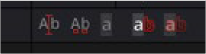
Text+ toolbar
When selected, you can type and edit text directly in the viewer. Clicking on the text in the viewer will move the insert cursor within the text. Left and Right Arrow keys will move the insert cursor between characters. Using the Up and Down Arrows will move between text lines.
The Manual Kerning button overrides the automatic kerning normally applied to text. Clicking the small red handle at the bottom of any character selects the character for kerning. You can also draw a selection rectangle around the characters you want to kern. Once any characters are selected, hold down the Option (macOS) or Alt key (Windows) while pressing the Left or Right Arrow key to make
small adjustments to the kerning of the selected characters. Hold the Alt + Shift (Windows) or Option + Shift (macOS) keys down while pressing arrow keys to move the character in larger increments.
To animate the position of each character, right-click on the control label Manual Font Kerning in the Inspector’s Advanced Controls and select Animate from the contextual menu. A new key will be set on the animation spline each time a character is moved. All characters are animated with the same spline, as with polyline mask animation.