< Previous | Contents | Next >
While Adams’ zone system was meant to teach people how to think about using the available range of the photographic medium when exposing images, the zones of the HDR palette let you put this
concept into practice by allowing you to make tonally-specific Color Balance, Saturation, and Exposure adjustments that only affect the range of shadows or highlights that fall within that zone.
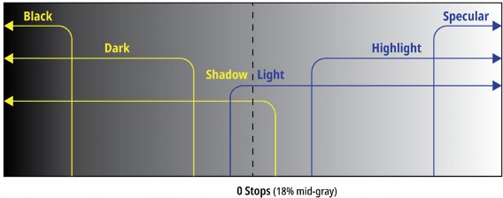
Using the default preset, the shadows of your image are divided into overlapping Shadow, Dark, and Black zones, while the highlights of your image are divided into separate overlapping zones for Light, Highlight, and Specular ranges. The chart below illustrates the relationship of these zones to one another.
Approximation of the overlapping zones in the HDR palette that can be individually adjusted

NOTE: All of the examples in this section have Timeline to Output Tone Mapping set to None, to keep the ramp gradient linear for purposes of this explanation.
NOTE: All of the examples in this section have Timeline to Output Tone Mapping set to None, to keep the ramp gradient linear for purposes of this explanation.
NOTE: All of the examples in this section have Timeline to Output Tone Mapping set to None, to keep the ramp gradient linear for purposes of this explanation.
Zone-Based Color Adjustments
![]()
Understanding how adjustments made using these overlapping zones interact with one another is key to knowing what you can do using the HDR palette. Keep in mind that every zone is customizable, but here’s how the default zone definitions work to let you make detailed image adjustments. For clarity, Zone adjustments are shown made to a linear ramp gradient image, to demonstrate exactly what tonal portion of each image is affected by each control.
— The Light and Shadow zones are the most broadly defined zones. Together, they cover the entire tonal range of your image. They softly overlap one another by two stops at the center of the tonal range (50% gray or 18% exposure); this is where adjustments made to Light mix together with adjustments made to Shadow, resulting in both adjustments softly blending together.
Making exposure adjustments to these two zones lets you manipulate overall image contrast by selectively compressing/expanding contrast in the shadows and/or highlights relative to one
another. Using the color controls lets you make broad color adjustments to the upper (highlights) and/or lower (shadows) range of image tonality.
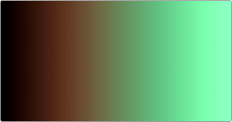
Color adjustments to a ramp gradient show the Light (tinted green) and Shadow (tinted orange) zones
— The Dark and Black zones overlap two progressively lower luminance ranges of the Shadow zone.
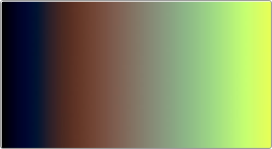
Dark is useful for adjusting the color or contrast of the deeper shadows, while Black is useful as a trim that lets you manipulate the very darkest parts of an image. All adjustments you make to Dark are mixed with any adjustments made to Shadow, and all adjustments made to Black are mixed with the adjustments made to Dark and Shadow. In this way, all color adjustments you make to overlapping Shadow zones mix smoothly together to produce the final result, as seen in the following ramp gradient.
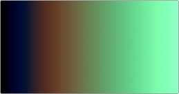
Color adjustments to a ramp gradient show the Dark (tinted blue) overlapping the Shadow (tinted orange) zone
— The Highlight and Specular zones overlap two progressively brighter luminance ranges of the Light zone. Highlight lets you adjust the color and/or contrast of the brightest highlights, while Specular is useful as a trim that lets you manipulate the very brightest highlights of an image. All adjustments you make to Highlight are mixed with any adjustments made to Light, and all adjustments made to Specular are mixed with the adjustments made to Highlight and Light. In
![]()
this way, all color adjustments you make to overlapping Highlight zones mix smoothly together to produce the final result, as seen in the following ramp gradient.
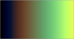
Color adjustments to a ramp gradient show the Highlight (tinted yellow) overlapping the Light (tinted green) zone.
As you can see, each one of these zones allow the specific adjustment of whichever parts of the image fall within the luminance range of that zone (as defined on the Zones panel), while providing control over how smoothly one adjustment fades into the next, to prevent unwanted contouring. As you make adjustments to the Range and Falloff of each zone using the different sets of zone controls, they work together to smoothly manipulate the contrast and color of the image, similarly to if you were using a more precise and constrained version of the Custom Curves. In fact, you can see the actual adjustment you’re making by exposing the Zone graph.
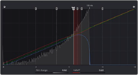
(Left) Raising the Range of the Light zone to expand the Shadow zone’s range of influence, (Right) The same adjustment seen in the Zone graph
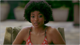
Working this way allows a tremendous specificity of adjustment, without the need to use curves or qualifiers. For example, zone-specific Color Balance controls allow you to grade the highlights and shadows separately using the Shadow and Light zone controls to quickly create a warm/cool split lighting effect. This makes the creation of dynamic grades more efficient and more creative.

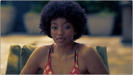
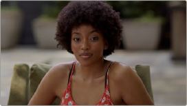
(Left) The original image, (Right) Using the HDR palette to warm the highlights and cool the shadows (exaggerated for print)
![]()
In this next example, the Dark zone’s Color Balance control is used to add a splash of green to the darker shadows of the image, while the Black control is used to neutralize this green in the very blackest shadows.
(Left) The original image, (Right) Using the HDR palette to add green to a narrow range of shadows