< Previous | Contents | Next >
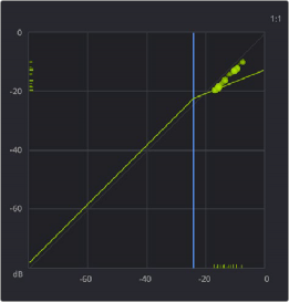
— The X axis (horizontal scale) represents the input signal level.
— The Y axis (vertical scale) represents the output level.
— The blue line represents the threshold.
— The light green line represents the dynamics curve (dependent on the process type and setting; this will change).
— The light green balls that animate in the upper area of the graph follow how the Dynamics control settings affect the signal as it moves above or below the threshold. The balls are affected by the attack and release settings, allowing you to visualize the way the compressor is affecting the input signal.
— The smaller lines that appear on the on the input and outline X-Y lines allow you to see exactly where the input/output levels are.
The Dynamics graph shows the response curve and how the signal is being affected by the current settings in real time.

The Dynamics Indicator on the channel strip displays the same curve, so you can see at a glance what is happening on that channel (but without the real time display). This indicator cannot be adjusted; you must open the Dynamics window to make modifications.
The channel strip Dynamics Indicator
![]()
Master Dynamics Controls
The Dynamics window contains the following overall controls at the top of the window:

NOTE: You can also turn dynamics on/off by single clicking on the Dynamics button (the mini graph) in the channel strip.
NOTE: You can also turn dynamics on/off by single clicking on the Dynamics button (the mini graph) in the channel strip.
NOTE: You can also turn dynamics on/off by single clicking on the Dynamics button (the mini graph) in the channel strip.
— Enable button: Turns the overall dynamics effect off and on, without resetting the controls.