< Previous | Contents | Next >
Buttons, Check Boxes and Lists
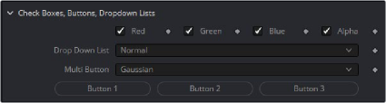
Buttons are moment activation and do not change state, used for triggering events Check Boxes switch between states, returning 0 or 1.
--Dropdown Lists are Combo Controls that will display and choose a number of items. This is 17 items, and will return numbers 0 to 16
InDropList = self:AddInput("Drop Down List", "DropList", { --UI Label, Internal Ref
LINKID_DataType = "Number", -- returns a number INPID_InputControl = "ComboControl", -- Type of Control
INP_Default = 0.0, INP_Integer = true,
{ CCS_AddString = "Normal", }, -- labels for each option in the list
{ CCS_AddString = "Screen", },
{ CCS_AddString = "Dissolve", },
{ CCS_AddString = "Multiply", },
{ CCS_AddString = "Overlay", },
{ CCS_AddString = "Soft Light", },
{ CCS_AddString = "Hard Light", },
{ CCS_AddString = "Color Dodge", },
{ CCS_AddString = "Color Burn", },
{ CCS_AddString = "Darken", },
{ CCS_AddString = "Lighten", },
{ CCS_AddString = "Difference", },
{ CCS_AddString = "Exclusion", },
{ CCS_AddString = "Hue", },
{ CCS_AddString = "Saturation", },
{ CCS_AddString = "Color", },
{ CCS_AddString = "Luminosity", },
})
Drop Down Combo Control lists give unlimited selection of items from a list. Returns 0 for first, 1 for the second Multibutton is similar to Drop Lists, each option is displayed on a button to make the options visible.