< Previous | Contents | Next >
Drop-down menu selections can be animated, with a value of 0 representing the first item in the list, 1 representing the second, and so forth.
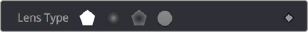
Button Arrays
Button arrays are groups of buttons that allow you to select from a range of options. They are almost identical in function to drop-down menu controls, except that in the case of a button array it is possible to see all of the available options at a glance. Often button arrays use icons to make the options more immediately comprehensible.
The Lens Type button array in the Defocus node
Color Chooser and Picker
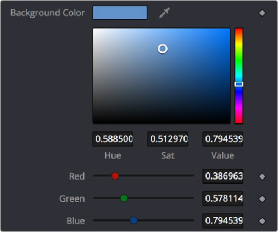
The Color panel is displayed wherever a parameter requires a color as its value, such as the Fill or Outline color in the Text+ node. The selected color is shown in a swatch with an Eyedropper to its right, and below the swatch is the Color Chooser.
The Color panel with transparency preview

TIP: Color can be represented by 0–1, 0.255, or 0–65000 by setting the range you want in the Preferences > General panel.
TIP: Color can be represented by 0–1, 0.255, or 0–65000 by setting the range you want in the Preferences > General panel.
TIP: Color can be represented by 0–1, 0.255, or 0–65000 by setting the range you want in the Preferences > General panel.
The Color panel is extremely flexible and has four different techniques for selecting and displaying colors.
macOS and Windows Color Nodes
Clicking on the color swatch will display the operating system’s standard Color Selection node.
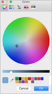
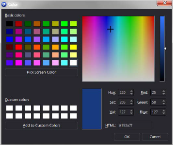
macOS Colors panel Windows Color dialog
Each operating system has a slightly different layout, but the general idea is the same.
You can choose a color from the swatches provided—the color wheel on macOS, or the color palette on Windows. However you choose your color, you must click OK for the selection to be applied.
The Color Chooser
You also have access to the built-in color chooser, which includes sections for choosing grayscale values, as well as the currently chosen hue with different ranges of saturation and value. A hue bar and alpha bar (depending on the node) let you choose different values.
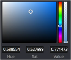
The color chooser in the Background node
Picking Colors from an Image

If you are trying to match the color from an image in the viewer, you can hold down the cursor over the Eyedropper, and then drag the pointer into the viewer. The pointer will change to an Eyedropper, and a pop-up swatch will appear above the cursor with the color you are hovering over and its values. When you are over the color you want, release the mouse button to set the color.
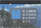
The Eyedropper with color swatch
The Color Picker normally selects from a single pixel in the image, but you can adjust the size of the selection by dragging into the viewer with the Eyedropper, and then holding Command and dragging out a rectangle for the sample size you want. The size change applies to all Color Pickers until the size is changed again.