< Previous | Contents | Next >
All changes made using UserControls are stored in the node instance itself, so they can be copy/ pasted, saved to a setting, added to the Bins, or added to your favorites.
An Example of Customizing Directional Blur
In the following example, let’s suppose we wanted to create a more intuitive way of controlling a linear blur than using the Length and Angle sliders independently.
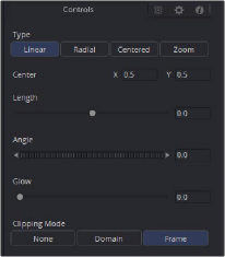
Default Directional Blur controls in the Inspector
We could use the Center input control, along with its preview control, to set an angle and distance from directly within the viewer using expressions.
1 Right-click the label for the Length parameter, choose Expression from the contextual menu, and then paste the following expression into the Expression field that appears:
-sqrt(((Center.X-.5)*(Input.XScale))^2+((Center.Y-.5)*(Input.YScale)*(Input. Height/Input. Width))^2)
2 Next, right-click the label for the Angle parameter, choose Expression from the contextual menu, and then paste the following expression into the Expression field that appears: atan2(Center.Y-.5)/(Input.OriginalWidth/Input.X , .5-Center.X) * 180 / pi
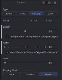
Directional Blur controlled by the Center’s position
This functions fine, but the controls are confusing. The Center control doesn’t work as the center anymore, and it should be named “Blur Vector” instead. The controls for the Length and Angle aren’t meant to be edited, so they should be hidden away, and we’re only doing a linear blur, so we don’t need the buttons for Radial or Zoom. We just need to choose between Linear and Centered.
Adding Another Control
For the first task, let’s rename the Center. From the Add Control window, select Center from the ID list. A dialog will appear asking if you would like to Replace, Hide, or Change ID. We’ll choose Replace. Now we are editing the Center input. We’ll change the Name to Blur Vector, set the Type to Point, and the Page to Controls, which is the first tab where the controls are normally. Press OK, and our new input will appear on our node in the Node Editor. The ID of the control is still Center, so our SimpleExpressions did not change.
To hide the Length and Angle, we’ll run the UserControls script again. This time when we select the Length and Angle IDs, we’ll choose Hide in the dialog. Press OK for each.
Finally, to change the options available in the Type, we have two options. We can hide the buttons and use a checkbox instead, or we can change the MultiButton from four entries to two. Let’s try both.
To add the checkbox, run UserControls again, but this time instead of selecting an existing ID, we’ll type Centered into the Name. This will set the name and the ID of our input to Centered. The Type is set to Number, and the Page is set to Controls. Now in the Type Attributes, set the Input Ctrl to be CheckboxControl. Press OK, and now we have our checkbox. To make the new control affect the Type, add a SimpleExpression to the Type:
iif(Centered==1, 2, 0).
Once that’s done, we can use the UserControls to hide the Type control.
To make a new MultiButton, run the UserControl script, and add a new control ID, TypeNew. You can set the Name to be Type, as the Names do not need to be unique, just the IDs. Set the
Type to Number, the Page to Controls, and the Input Ctrl to MultiButtonControl. In the Input Ctrl attributes, we can enter the names of our buttons. Let’s do Linear and Centered. Type them in and hit Add for each. Press OK, and we have our new buttons with the unneeded options removed.
To make this new control affect the original Type, add a SimpleExpression to the Type:
iif(TypeNew==0, 0, 2).
Once that’s done, we can use the UserControls to hide the original Type control.
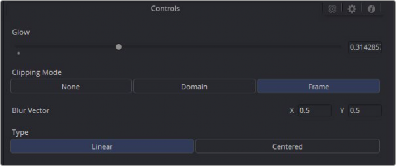
Directional Blurs with UserControls applied