< Previous | Contents | Next >
— Done: Prevents any point along the spline from being moved or modified. Also, new points cannot be added. You can, however, move and rotate the entire spline.
— Close: Closes an open spline.
— Smooth: Changes the selected control point from a linear to a smooth curve.
— Linear: Changes the selected control point from a smooth curve to linear.
— Select All: Selects all the control points on the spline.
— Show Key Points: Shows or hides the control points along the spline.
— Show All Handles: Shows or hides the Bézier handles along the polyline.
— Shape Box: Places a reshape rectangle around the selected spline shape. Using the reshape rectangle, you can deform groups of control points or entire shapes much easier than modifying each point.
— Delete Points: Deletes the selected control point(s).
— Reduce Points: Opens a Freehand precision window that can be used to reduce the number of controls points on a spline. This can make the paint stroke easier to modify, especially if it has been created using the Draw tool.
Change the way the toolbar is displayed by right-clicking on the toolbar and selecting from the options displayed in the toolbar’s contextual menu.
sRectangle
The sRectangle node
The sRectangle node is used to create rectangular shapes. Like almost all shape nodes, you can only view the sRectangle node’s results through a sRender node.
External Inputs
This node generates shapes and does not have any inputs.
Basic Node Setup
The sRectangle node is a shape generator, meaning it generates a shape and therefore has no inputs. The output of the sRectangle can go into a sRender for viewing and further compositing or, more likely, connect to another Shape node like sGrid or sDuplicate.
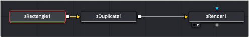
An sRectangle node connecting to an sDuplicate node, and then viewed using an sRender node
Inspector
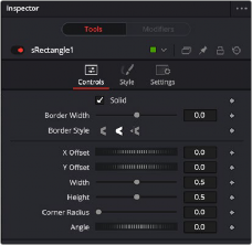
The sRectangle Controls tab
Controls
The Controls tab is used to define the rectangle characteristics, including fill, border, size, and position.
When enabled, the Solid checkbox fills the rectangle shape with the color defined in the Style tab. When disabled, an outline created by the Border Width control is displayed, and the center is made transparent.
This parameter expands or contracts the border around the shape. Although it can be used when the Solid checkbox is enabled, it is primarily used to determine the outline thickness when the checkbox is disabled.
The Border Style parameter controls how the sides of the rectangle join at the corners. There are three styles provided as options. Bevel squares off the corners. Round creates rounded corners. Miter maintains pointed corners.
When the Solid checkbox is disabled, three Cap Style options are displayed. The cap styles can create lines with flat, rounded or squared ends. Flat caps have flat, squared ends, while rounded caps have semi-circular ends. Squared caps have projecting ends that extend half the line width beyond the end of the line.
The caps are not visible unless the length is below 1.0.
The Position parameter is only displayed when the Solid checkbox is disabled. It allows you to position the starting point of the shape. When used in conjunction with the Length parameter, it positions the gap in the outline.
The Length parameter is only displayed when the Solid checkbox is disabled. A length of 1.0 is a closed shape. Setting the length below 1.0 creates an opening or gap in the outline. Keyframing the Length parameters allows you to create write-on style animations.
These parameters are used to position the shape left, right, up, and down in the frame. The shape starts in the center of the frame, and the parameters are used to offset the position. The offset coordinates are normalized based on the width of the frame. So an X offset of 0.0 is centered and a value of 0.5 places the center of the shape directly on the right edge of the frame.
The Width and Height parameters determine the vertical and horizontal size of the rectangle. If the values are identical, then you have a square.
This parameter determines if the corners of the rectangle are sharp or rounded. A value of 0.0 produces sharp corners, while a value of 1.0 will create a circle from a staring square shape or a pill shape from a rectangle.
The Angle parameter rotates the shape based on the center axis.
Style Tab
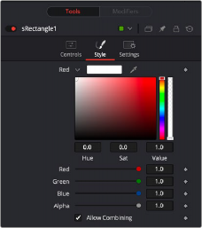
The sRectangle Style tab
Style
The Style tab is used to assign color to the shape and control its transparency.
The Color parameter controls determine the color of the fill and border from the sRectangle node.
To choose a shape color, you can click the color disclosure arrow and use the color swatch, or drag the eye dropper into the viewer to select a color from an image. The RGBA sliders or number fields can be used to enter the value of each color channel or the strength of the alpha channel.